The new Stacks layout is great in many ways and it’s something I’ve been wanting for a long time!
However, I’ve been struggling with many of its quirks, which I expect to just work, specially being also a web developer and noticing that it’s still a bit far from being 1:1 to Flexbox.
Overrides
Replacing symbol overrides that don’t have the same dimensions will simply distort them, if they don’t share the same aspect ratio.
I understand that this somehow clashes with this issue, but I don’t think that forcing a full resize isn’t the best behavior either.
Please, give us options to control what to expect, ideally all the following:
- Resize to match original override or just one of the sides, using the same logic as CSS’s object-fit (The current behaviour matches
fill). - Keep original size of the new override.
- Resize to match just width/height of the override, forcing the other dimension to resize as needed. (Similar to the
contain/coverof first option, but now one side is explicitly chosen by the user).
Negative spacing
I’m pretty sure this was mentioned before, but please add support for negative paddings and (bring back) negative spacing between layers.
Custom offsets for individual children
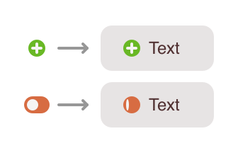
Sometimes, I want to use the alignments, but want to offset some individual layers, while still benefiting from the automatic alignment.
For example, I might want to make a button with icons in it, but I might need to visually align the text 1px up or down, or because the text’s line height is an odd number while the icons have even numbers, and I don’t want either of them to be aligned in half-pixels.