I’ve got a few issues with Layouts and Stacks compared to the old horizontal/vertical layouts. They are more powerful, but also, and also more complex. Let me try to explain.
Different Paddings
It used to be that a vertical layout could have different paddings between the elements and respect those when resizing.
ie. I have a small heading, a big heading and a text block. There is 10px between the first two, and 20px between the second and third item. Changing the width or changing the text, those paddings would be respected in the old days. Now in Stacks there is only one spacing value, I can’t reproduce this without nesting another Stack in the Stack.
Space-Between and spacings
This one didn’t work before, but can we have a spacing value possible when setting space-between?
ie. I have a typical button with an icon with a fixed width. I want a minimum spacing between the 2 elements before my text wraps on a second line.
Again I could create a stack for the icon and add a padding, but that’s not ideal.
I feel like those 2 problem could be solved if elements/groups/frame could have their own external margins. But maybe that’s a layer of complexity too much.
Old layout would never break my design
I guess it’s somehow a but inevitable with the new power of stacks, but using the old layout using a layout would never disturb my design.
Now if I design something, and decide to make it a stack, it can easily be an explosion. I find it harder to design first, then convert into a Stack.
I feel I’ll need to convert to starting a Stack and add to it, and I’m not sure I like that limitation.
Automatic width at ‘Fill’ if elements touches the padding on both sides
I feel like the app makes an ok job of setting up stacks automaticly from a design, but still I feel like I have to always modify a ton of stuff for it to resize properly.
One thing that could help would be if items that touch both sides of the Frame padding when created would be set to width:fill.
ie. When creating a typical ‘card’ for the web, like here. I wish all the elements except the small title would be in width:fill already.
Those are my critics so far. I’m kinda liking the new Stacks, but I find they limit free design a bit more and sometimes wish I could also have the old horiz/vert layouts also as an option. Considering they still work when importing files
I think overall stacks are better, but smart layout did have some of these advantages - I think you can still use them? Not sure if they have a keyboard shortcut still bound to it though
One thing that’s of mixed use is that nesting stacks is a better reflection of how those container structures would be created with flexbox. So that’s something
Thanks so much for taking the time to share your feedback. Here are my follow-up answers. I hope they help!
Different paddings (spacings)
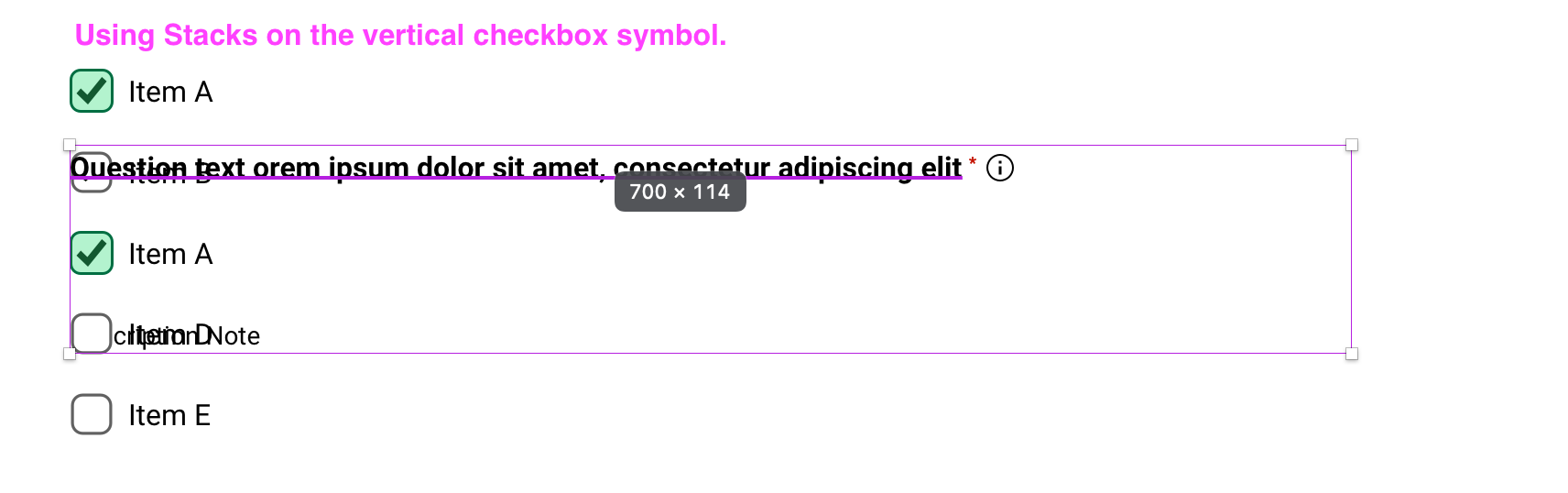
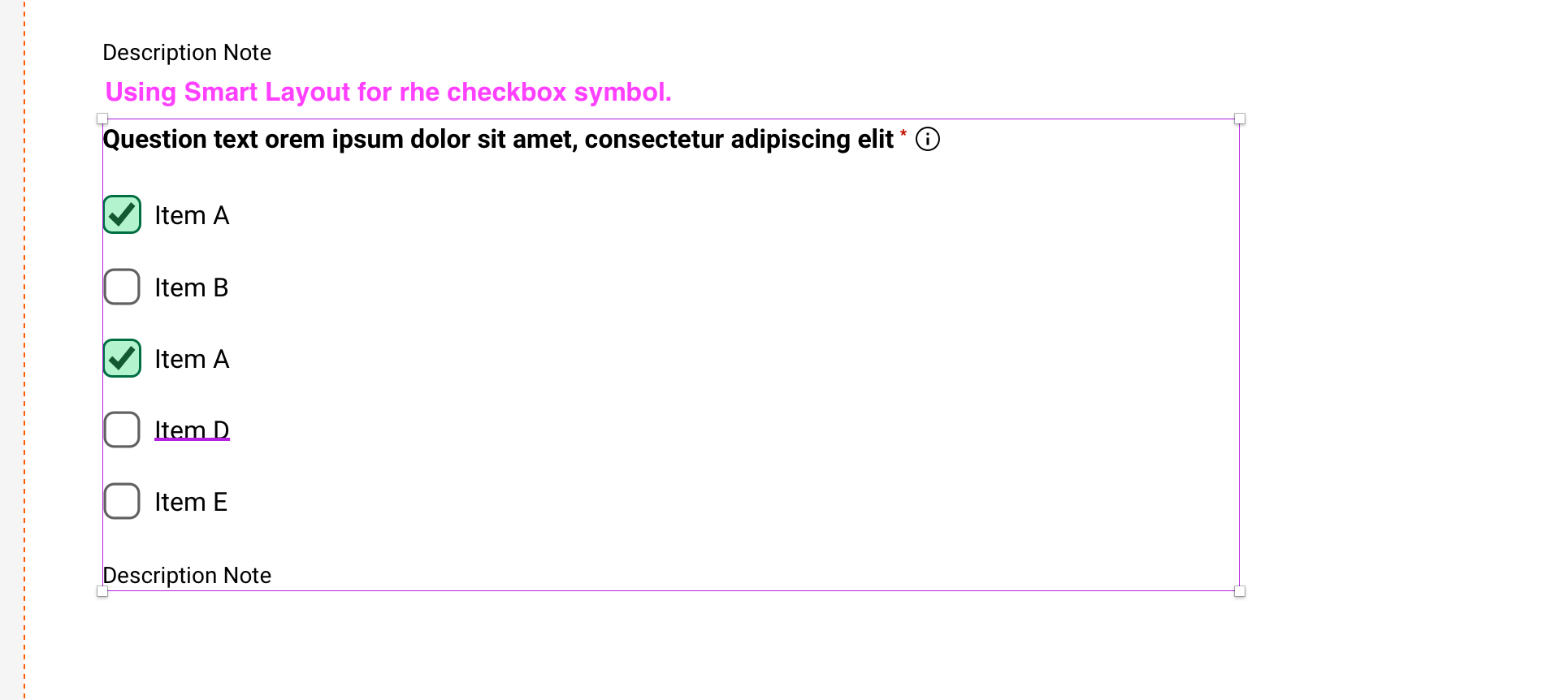
Indeed, stacks can only have one spacing value for the direct children inside a stack. This may seem a bit strict, but it also makes stacks very predictable and easier to use.
You can add a group quickly to set different spacings, or nest inside a new Stack, which gives you a lot of power, because you can control all settings in the nested stack, which isn’t possible in Smart Layout.
Space-between and spacings
Can you share a bit more about how you want your button to work? From your feedback, You can already set a button’s text to wrap:
Set a horizontal stack
Use the spacing value to define the distance between the icon and the text
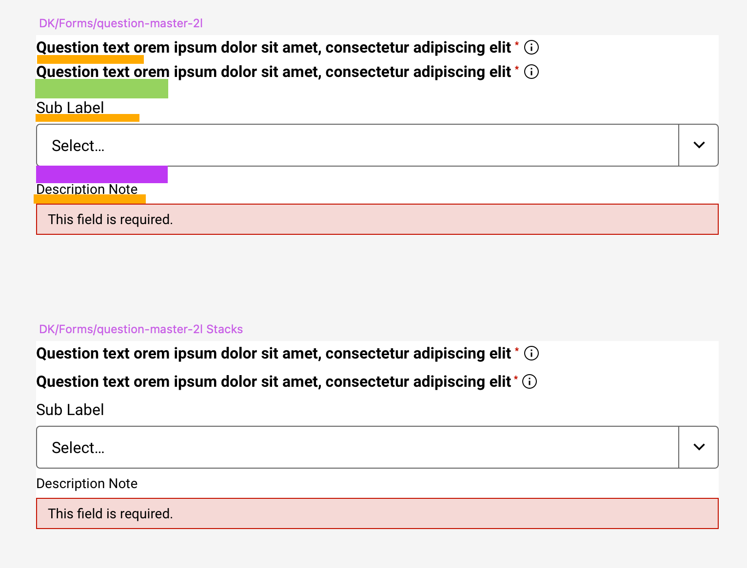
That’s a key difference between each layout engine. Smart Layout recorded all spacings as-is; stacks apply the spacing rule to all children, but paddings are kept. For instance, if you design a card and add a background, the distance from each layer to the edges will be translated as paddings, and you can adjust them later on.
I know it may feel a bit like stacks are “moving my layers”, but since the rule is consistent it becomes easier to build.
Automatic width at ‘Fill’ if elements touches the padding on both sides
Thanks for this feedback, I’ll pass it to the team. You can use a shortcut to quickly change to Fill: press ⌥ and double click a layer or nested stack edge.
You can still use Smart Layout
Any files containing Smart Layout designs will be imported to Athens and will work as usual. You can still build with Smart Layout too. You can find it in the menu bar in Arrange > Smart Layout (Legacy), or through the Command Bar.
Hi Jorge,
Thanks for taking the time to answer my issues!
Different paddings (spacings)
I understand the predictability and ease of use, but I find it a bit much to nest in a Stack just to add a spacing/padding.
I think I’d prefer to be able to cmd+click on a padding on the canvas to adjust it independently. And have the spacing in the inspector just say ‘multiple’. I could type a spacing in the inspector again to make them all the same.
But I get you would prefer to keep it simple.
For the second button, I’ve wrapped the arrow icon in a Layout and gave it a left padding.
I feel like it could be useful for other situations, but I guess it might be enough of an edge case to justify the nesting.
Automatic width at ‘Fill’ if elements touches the padding on both sides
I didn’t know that shortcut, it’s nice. Thank you.
You can still use Smart Layout
@Ash You can still use them it seems, I’ve noticed after posting. There doesn’t seem to be a shortcut anymore, but it’s in the menu and the command bar still.
I’d like to agree with Jean’s comment about spacing in stacks. Smart layout allowed for more control - and this is a big miss. In my example I want to use stacks to control the height in terms of re-flow, but I want to keep my individual margins between my rows - I do not want them to be uniform in the stack. It’s impossible/to fiddly to try and re-group/use multiple stacks.
Can we have Smart Layout back? Or have an option to control individual margins please?
I think I’d be all for additional margins for stack objects. The alignment overrides already so a little to reduce the need for nested containers, object margins would go even further.
Thanks Raulrincon, question: it’s denoted as “legacy” so how long will it be around for?
The fact it’s marked as “legacy” worries me as things could break in the future as legacy suggests it will be removed soon?
Additionally Stacks doesn’t work at all times as you would expect.
I’m having to use a combination of stacks and smart layout for my symbol to work as I want it to/expect it to. I.e. a field area resizing depending on which field symbol (which is a symbol inside my parent symbol) I swap it to.
Thanks for the callout and the ping. We have no plans yet to remove Smart Layout at all from the app. We just decided to call it legacy cause most of the improvements to our layout options are going to be arriving as improvements and enhancements to Stacks rather than Smart Layout.
If Smart Layout was to ever be removed (as I mentioned, we don’t have plans) we’ll probably make sure to let our user base know beforehand with a lot of time before it happens.
Rest assured, we’ll make sure this is the case and keep you guys in the loop.
Use case
For that specific use-case, you should be able to use Stacks without issue to get the same result, would you mind sharing a sample doc where we can take a look?
As Raul mentioned, there are no plans to remove Smart Layout. We’re aware that the legacy labeling can set some expectations, but you can use Smart Layout in Athens just like you’ve done so far.
Now, let’s go into your questions:
Can you elaborate a bit on this? I’m not sure what you mean with converting bigger files.
We have no plans to remove Smart Layout. We’ll focus on supporting your workflow with any future changes that come to Sketch rather than think of specific dates to sunset anything (not that we’re planning to).
Symbols are a core feature and we’re always keeping an eye on things that need improvement. Can you elaborate more on this question, please?
I’d say it depends , but as a general guideline, move to Athens at your own pace. You don’t have to migrate your Design System. Explore the new capabilities of Frames, Graphics and Stacks. If you need to create a new component, try creating it with the new features. This will help you familiarize with the latest and be more confident when you decide to integrate things like Stacks into your workflow.
And last but not least, feel free to ask any questions about how to use the new features.


 , but as a general guideline, move to Athens at your own pace. You don’t have to migrate your Design System. Explore the new capabilities of Frames, Graphics and Stacks. If you need to create a new component, try creating it with the new features. This will help you familiarize with the latest and be more confident when you decide to integrate things like Stacks into your workflow.