
With a little humor.
2 Likes
Hey folks ![]() Today’s beta update includes a number of small fixes and improvements, but also nested folders!
Today’s beta update includes a number of small fixes and improvements, but also nested folders!
In short, projects and collections in your workspace are now simply folders. This revolutionary naming reflects the fact that unlike projects and collections, you can now nest folders infinitely. So, if you need to get very specific about how you organize your workspace, this is for you.
A couple of important notes:
- During the beta, nested folders only appear in the Mac app. In the web app, you’ll still see projects and collections. Any nested folders will appear as single-level collections within a project.
- You can nest folders infinitely, but they’ll always inherit the permissions of their top-level parent folder. This avoids a world of pain trying to infer which set of conflicting permissions wins out.

6 Likes
For those who have a version for MacBook (without cloud) there will be no folders?
It would be very nice to just basically mix up drafts, projects and completed projects.
A post was split to a new topic: Font selection panel feels slow
If you’re on a Mac-only license (no workspace/cloud) then you won’t have nested folders in the same way, no. Long term, I think it’d be nice to improve our Workspace window with better support for local files, but right now we fully rely on Apple’s native file picker for local files (which of course means you can use native macOS folders and organize everything as you like).
2 Likes
Hey folks ![]() As I said before, there’s far too much in flight for me to give you a complete list of everything we’re changing and improving as a result of beta feedback, but here are a couple of things I hope will be popular here:
As I said before, there’s far too much in flight for me to give you a complete list of everything we’re changing and improving as a result of beta feedback, but here are a couple of things I hope will be popular here:
- We’re bringing the export panel back into the Inspector, inline.

- As we’ve mentioned elsewhere in the forum, section headers are coming for color variables.

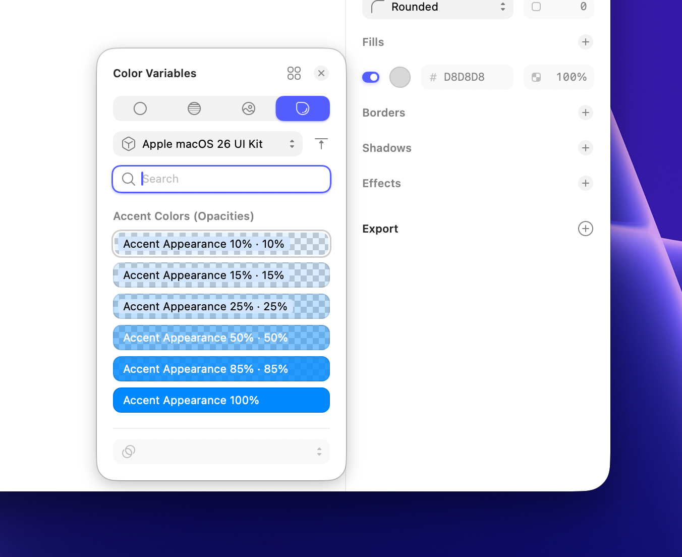
(The designs below still need some polish, so don’t read too much into them — but I hope you’ll appreciate us sharing incomplete stuff earlier.)
Naturally, we’ll keep reviewing feedback here and elsewhere and making changes while we’re in beta — and after the final release.
13 Likes
Standing ovation!
That’s the spirit.
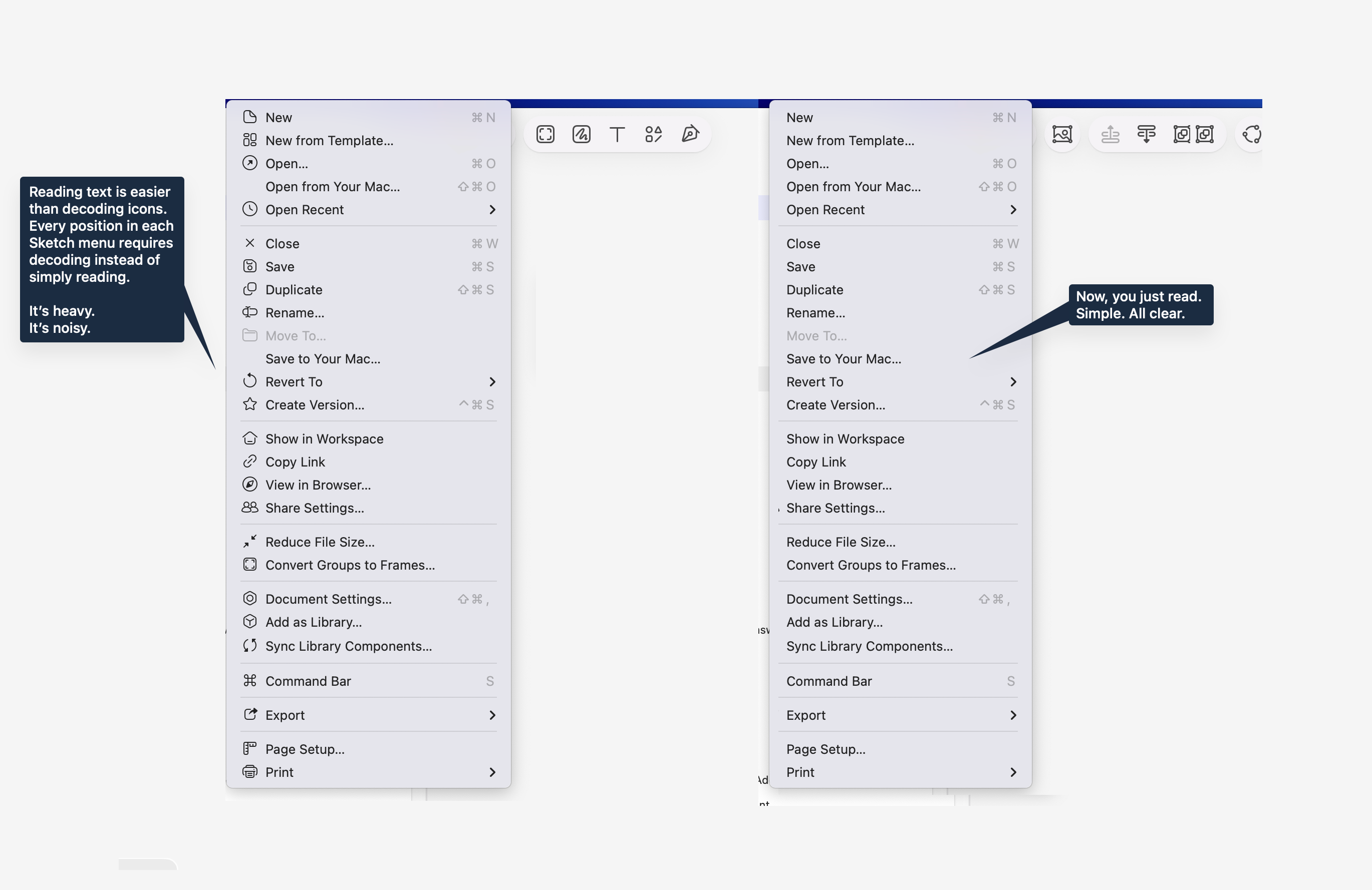
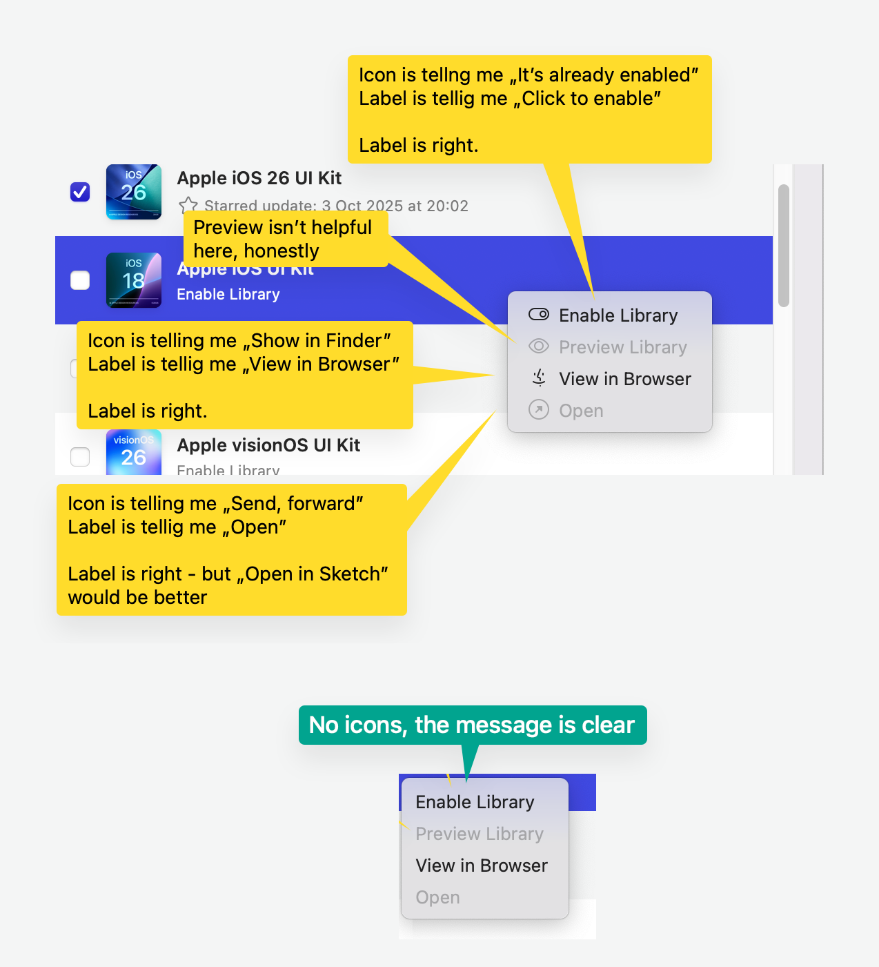
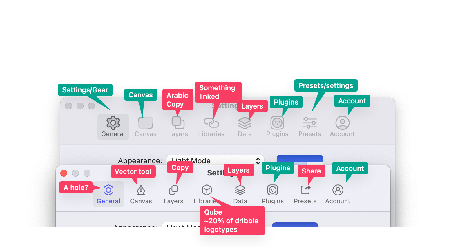
@freddiewrites I am adjusting nicely to most of the new icons, but I can’t wrap my head around this one for settings/options/etc (image attached below). I have used apps for years that use this type of icon for settings and I still do not recognize it as a gear/bolt. I feel like my brain short circuits when I see it and settings is never the concept that comes to mind. I get that it looks clean, but it fundamentally fails to intuitively communicate to me what it needs to convey. If the Sketch team could reconsider this icon to be a simple gear with visible teeth, my brain would be very grateful.

3 Likes
As much as I love new icons and think they’re executed extremely well, I have to agree here. You need to read the text anyway, and icons just add confusion to the brain. I don’t think this will change, nor is this my request. It’s just an observation.
I get the intent. “Lets add some nice looking icons, menu looks nicer, your eyes have an anchor point when scanning menu items, etc.”, but unfortunately it just doesn’t work as intended. Human brain is an intricate thing.
3 Likes

On the icons: you’ve made your point quite clear, thanks.
Regarding opening the color variables in the color panel: You can hold ⌥ to open the panel in the color variables tab, but we’re also looking into reversing that behavior if you’re already using a color variable.
2 Likes
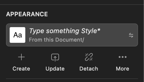
How do we update text shared styles now? Just don’t see how we can update them after any changes any more


We used to have an update button
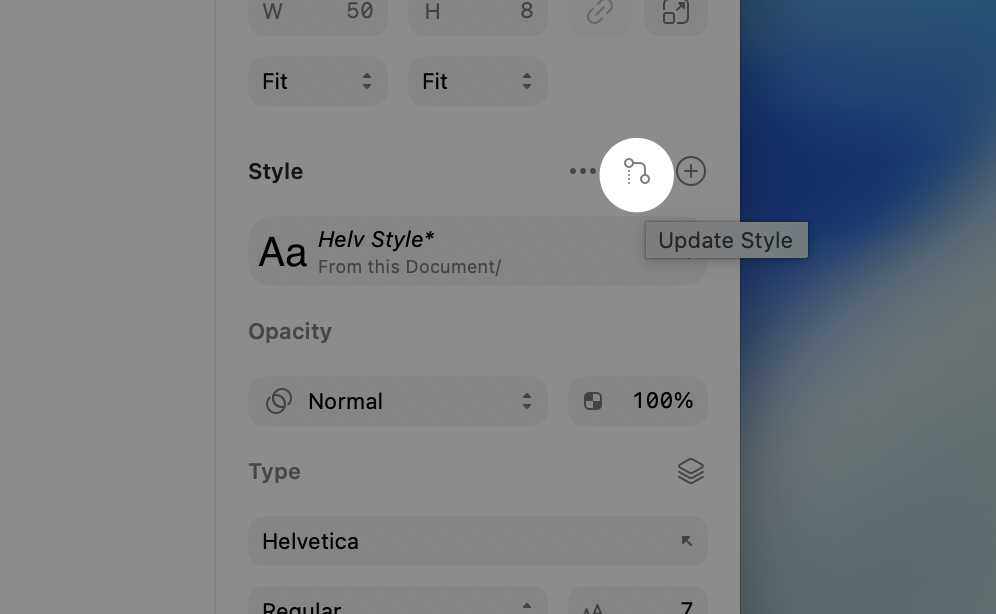
ahhh, I was unfamiliar with the new icon and thought that was something else. Thanks
1 Like

Same here. And even after the days of use, I still double-check (unnecessary cognitive load) because the icon feels like I am actually detaching the style, rather than updating it.
1 Like
Some visual bug in the components panel. Tried different styles and restarting the Beta app, still same:

In Components, I can’t set up what can be overridden:

1 Like
I just want to say that I’m wrapped for “Wrap for Stacks” ![]()
1 Like
@jirirbr I’m taking a look and filing about that truncated menu (as I might have told you somewhere else ![]() )
)
While you’re at it there’s a related bug when you resize the sidebar