New Mac Beta: Copenhagen (2025.3) available now!

Hey folks :waving_hand:

We have a new beta out today — Copenhagen. You can download it from sketch.com/beta or open your existing beta build and follow the prompts to update.

This update is our major redesign for macOS Tahoe, along with a full rewrite of the Inspector. As you can imagine, we’re shipping this beta with a few known issues (nothing major, though) and we hope you’ll help us squash a few more before the final release.

With that, please create backups of any documents before you open them and let us know if you see anything that doesn’t look right. You’ll find release notes over on the beta page, but if you’re interested, here’s a bit more detail and backstory behind this release.

We’re a little later than we’d hoped to be with this, and for a couple of good reasons:

  1. We always want these redesign updates to be more than a fresh coat of paint. They have to improve functionality, too.
  2. With any major macOS redesign, we spend time figuring out what to adopt and what to go custom on — this release was no different.

Let’s get the details — starting with what’s new.

A rewritten Inspector

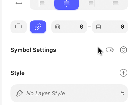
The Inspector isn’t just a redesign, it’s a from-scratch rewrite. Lots to say about this and I can’t cover it all here, but the biggest change is most popover menus have been replaced with floating panels you can freely move (including for colors, which we know has been a longstanding issue).

The new colors panel has lots of nice improvements; variables have their own tab, blend modes are part of the panel, it’s easier to switch between RGB/HSB/HSL values, gradient presets get their own dedicated view, it’s easier to choose color variables when editing gradient stops.

Pretty much every control in the Inspector is now custom. This allowed for; scrubbing text fields without focusing them, scrubbing support for numeric fields (and pretty much any single-digit input), more consistent multi-selection handling (and proper mixed states), double-clicking sliders to reset to their ‘natural’ value, holding down ⌥ to access alternative functionality (such as quickly removing fills — try it!).

A new, contextual toolbar

Beyond the custom Liquid Glass, the new toolbar is contextual, and changes depending on what you’re doing and what you have selected. We’ve also moved a number of tools from the Inspector to here (such as vector editing tools) because tools = toolbar.

It’s worth knowing that with this, you can’t customize the toolbar anymore, but hopefully you’ll appreciate having the right tools, at the right time, at the top of the Canvas, without having to think about it.

A clearer, focused layer list

The layer list has new iconography (in fact, everywhere has new iconography — there are well over 700 new icons!) and path lines to make your document’s layer hierarchy easier to parse.

There’s also new focus mode which filters the layer list to only to show only siblings and the parent container(s) of the layer(s) you’ve selected. It also collapses containers and groups automatically.

This focus mode is enabled by default, but you can toggle it off (to see all layers at all times) by clicking the icon at the bottom of the layer list next to the search field. Or type “Focus layer list” in the Command Bar.

Wrap for stacks

A much-requested feature when we launched stacks. You can now set items in a stack to wrap when their combined height (for vertical stacks) or width (for horizontal stacks) exceeds their container’s fixed dimensions. You can also choose how items that wrap align.

Image background removal

You can now remove backgrounds from images using two new tools: one for images with objects in the foreground, and another for images with people. Both use Apple’s on-device, machine learning frameworks.

Many more smaller improvements

There a bunch of smaller improvements we’ve made in this release — and the groundwork we’ve laid with the rewrite of the Inspector especially makes it a lot easier to keep making improvements going forward. You’ll find details of these in the release notes.

Alright, now you know what we’re shipping, let’s talk about how we got here…

The story behind the redesign

First up, inset sidebars. You’ll have seen those around Tahoe already and probably have your own opinions on them. We spent some time prototyping how these could work but ultimately decided they’d add too much noise to the editor. In the end, we cooked up a custom implementation that gives us some nice symmetry around the Canvas.

Next, Liquid Glass. We shipped our own Glass effect as quick as we could after WWDC to allow others to design with it — and also for us to test how it could work in our redesign. In the end we brought it to the toolbar and went a little custom. For example, we removed the dynamic shadow, which wasn’t really working in the context of our Canvas.

Finally, document tabs. These were tricky because the standard Tahoe implementation really didn’t play well with Sketch. We also explored a custom implementation which didn’t feel much better. In the end, we came up with including document tabs above the layer list in the sidebar. This took a moment to get used to, but ended up feeling really natural.

By the way, document tabs now have a Sketch-specific setting which we enable by default in Copenhagen. If you prefer to open documents as separate windows, you can switch to this in Sketch’s settings.

That’s it for now. Do check out the full release notes on sketch.com/beta and let us know about any bugs you run into. As ever, and once again, make backups of your documents before you open in them in a beta.

Thanks!

P.S. To save the replies below becoming hard to follow, please report any bugs you find in Share an issue — thanks!

14 Likes

Wow!

I was literally waiting for this version of Sketch since June 2023:

I literally logged in just to let you know that this New Mac Beta is awesome!

Great job Sketch Team! :clap::clap::clap:

3 Likes

Amazing work team! Looking forward to trying this out..

1 Like

Here’s the first complain for ya:-) Those icons are literally smaller than the cursor and are quite hard to target.

2 Likes

The first impression is great—definitely a step forward!

I enjoyed working on the first project, and it’s a big plus that I can now change the opacity of shadows directly in the panel without having to click into the color settings first.

However, it unfortunately lags quite a bit, and the overall performance is lacking. Even with a pretty simple symbol made up of just text, the whole program froze and slowed down my work on the file.

I’m also not a fan of the new window for saved colors from the library; it makes the whole process take longer (maybe it’s just a matter of getting used to it).

As for exporting to graphic files, I don’t feel completely comfortable and natural with it just yet.

2 Likes

Interesting! We deliberately made the hit area bigger than the toggles themselves so they shouldn’t be too tricky to target. I’ll pass it on, though, of course!

1 Like

That’s unusual — especially since we’ve actually done a fair amount of performance work on this release. If it continues, will you keep us posted? Someone from the team might want to dig into it a bit more with you to figure out what’s going on.

When dropping an image into sketch, it used to have an Original Size button on the right panel, but this seems to be missing in the beta. Used to drop in images, it would sometimes set them to random pixel sizes, so click Original Size, and then /2 as it was saved at 2x. Can see it is in the menu, is this being removed from the side panel?

1 Like

Yeah, I expected that, but the click area turns out to be only couple px larger for one of the icons

.

Also, as a side note: would be useful if the buttons were toggles, so an icon opens AND closes its panel.

3 Likes

Good to know — thank you!

1 Like

From the top of my head: for those (and similar) tiny elements a hover state showing actual hit area would be useful. That would ease cognitive load of trying to hit exactly the icon.

2 Likes

Hello @damiandmowski!

In Product Support we’d like to know more about these performance issues. Could you send an email to productsupport@sketch.com including some information?

  1. A screen recording of the issue: just to see it what type of performance issue is. Please try to show the whole screen, it helps to see it in context.
  2. I would ask for an affected document as well, but if this is happening with any document, I suspect this could be related to something else in your Mac. Could you include some screnshots showing your installed plugins?
  3. Additionaly, could you try in Safe Mode and let us know the results as well?

In short, an email to productsupport@sketch.com telling us if Safe mode improved anything, the list of plugins and also a screen recording. We’ll try or best to diagnose the issue!

Good job on the redesign! Very tasteful. In my brief testing I didn’t find much issues – except for one thing; and quite and important mind you. Please, do not remove the step arrows in fields, which appear on mouse hover. I attached the screenshot. That is something I use gazillion times during the day, and something even figma doesn’t have. It is much easier to click with mouse a few times on these tiny arrows and see the results on the canvas, that it is to take the hand off of mouse and move over to the keyboard, or to click and drag. Clicking those tiny arrows is a superior action, period. Thank you for your consideration.

CleanShot 2025-10-24 at 21.06.02

6 Likes

I actually really love the the minuscule nature of these toggles. :slight_smile:

Request: keep the text size presets in a select popover please. Matter of fact, expand it to 96 and 144; and make it customizable.

or a request in general - anytime user needs to take their hands off of mouse and move to keyboard - it’s better not to. breaks the flow. same with the small arrows on fields, as I mentioned in this thread. Ty so much. The redesign looks good, just don’t remove what makes you great.

4 Likes

Thanks for the new beta—loving the refreshed design and the inclusion of support for non‑Liquid Glass in lower macOS versions. Quick question: is there a plan to bring back the ability to hide the top toolbar, as in previous versions, via the Option + Command + T shortcut? That toggle was super useful for maximizing canvas space during focused work.

First, it’s a change, so it takes a minute to look around. It’s refreshing, you didn’t go too crazy about Liquid Glass, files on the left are growing on me. Layers list is much better, it’s much easier to understand the hierarchy.

I won’t expand on what I like and keep this to what I find negative, as that’s how we can make Sketch better.

Left panel

The button to show components - ok, shows me components. How do I get back? Oh, I need to click that button again. Should it be a toggle like before, or at least change the icon so that I know I’m getting back?

1 Like

I noticed that if there is a text, as in this case you can click on it and it will work.

Some menu items show a hot key, others do not.

In general, I would like the hot key to always appear next to the name of the button. For those who are just starting to work in Sketch, this will allow you to learn these keys faster.
If someone gets in the way, you should be able to disable their display.

very much like the update, contrasting values on the panel is a great solution in my opinion.

1 Like

That’s the expected behaviour for any checkbox/toggle control (in general), would be surprised if it didn’t:-)

1 Like