I’m exhausted.. I just finished finding workarounds for the last redesign.. and now everything has changed again. It’s impressive that you can redesign the product so frequently, but for the rest of us - we need to get work done fast - not relearn the UI/UX every 3 months. I’m finding things have been radically moved around and changed for minimal benefit. In fact many tasks take longer.. hiding things in horrible cascade menus instead of single click as before. removing the steppers on the inspector - so I now have to grab a tiny icon and use it as a slider.. ugh. The context sensitive toolbar is a showstopper - today I was wondering why icon buttons had disappeared.. and discovered I was in a different mode - this is where the term ’help I’m stuck in a mode!’ came from. Choosing color variables is now a multi-click process. I could go on and on and on.. on a positive note note I am glad you have stopped wasting efforts on ‘blur effects’ that I’m sure no one uses!
Please do a serious usability study and stop changing things that have proven to be successful in the past. Consult Neilsen and Norman for UX advice. I am now throwing in the towel and reverting back to the previous version.. as this is just not working.
I agree with you so much.
Today I sat to work - real life clients, deadlines, environment… and it was so frustrating because I found myself looking for things all the time. Having to literally “try” icons to check what they were because the icons and tools now don’t even show a label/tooltip when hovering them! The toolbar is gone, you can’t custom it as used either - document tabs are in the sidebar (why?!?!?!) where we already have thousands layers… so many things displaced, unlabeled, showing and not showing… to edit a symbol was a drama! Luckily I still have most of my shortcuts but seriously, it’s bad. I’ve been using Sketch for probably 10+ years now and I felt dumb - old, in need to learn a software that has been my most constant tool in the past few years. I feel like you are trying so hard to be Figma that you are loosing your identity, you are loosing your focus. Please take all in from the user’s feedback and do better. Today, for the first time ever, I subscribed to a Figma plan because, although I don’t use Figma, I know where things are and how it works, and I need to get work done fast. I hate Figma. Don’t make me hate Sketch. You are so much better than this.
Thank you for your candid and detailed feedback regarding the recent UI/UX changes. I’m sorry to see that the recent changes are disrupting your work and causing significant friction, stress and slowdown.
We do not want the learning curve to interfere with your deadlines. Just to remind you, you can revert to the previous version. This is something we’ll always allow, and you can revert to an earlier version at any time. Simply download a previous Sketch version from our Mac app updates page, and that’s it. You can have both installed if you want to. Both versions will share the same preferences and plugins.
This will allow you to work quickly and reliably, just as you did before, especially if you’re under deadline pressure. Then you can reserve the process of learning the new UI for a less busy time. There’s no need or obligation from our side to stay in the latest version of Sketch.
In any case, please be assured that we are considering this feedback and are committed to listening to it. We value your commitment to Sketch and appreciate your feedback, as well as the time you’ve taken to share it with us.
Thanks again for your feedback ![]()
I would like to agree with @bman and @mica - and add to the fact that this new UI is not very good, it has major usability and accessbility issues. Everything is harder to see and harder to understand, you can’t just reply on colours for active states for example! All the tool buttons are hard to see and, like you said things being moved around is a nightmare.
I feel this needs another redesign to make it more usable. Are there improvement in the works @JorgeF ?
I’m doing my best to encourage our agency to stick with Sketch instead of moving to Figma but changes that make Sketch less user friendly, like these make it harder to convince them. What set Sketch apart from Figma was the great, user friendly and less fiddly UI. This seems to be lost recently. I’m hoping you get back on track. ![]()
Hello @Gregfgn, thanks for your feedback.
We’re now listening to your feedback and open to improvements, but I’m afraid that we’re not reconsidering a whole new redesign. Sorry about that.
I am interested in something you mentioned:
you can’t just reply on colours for active states for example
Could you elaborate on this? Is there any previous behaviour you’re missing from the previous version that we could be missing here? Please let me know so I can pass it to the team.
Sure @JorgeF , sorry I had a typo, it should read “just rely upon…”
It’s relating to the active states on the new floating rounded action bars. The active state of an icon is shown just by colour - that’s not very accessible and obvious!
These new tool bars really are not the best UI/UX. Having them float on top of the canvas instead of being sectioned off (like the side bars) make them a lot harder to pick out against artwork behind them. The sizing, and alignment of them also splits your vision and focus.
Also finding the font size of layer names in the side bar and inspector a little too small!
Thanks for the clarification, Greg! I’m filing your feedback internally so our Product team can take a look.
Completely agree with the other frustrated users. This redesign breaks so many UI/UX best practices.
My productivity using sketch has halved. I will be switching back to an older version.
Thanks for the attention BUT switching back is a step backwards that doesn’t really help long term - docs says it was created/edited in a newer version, I’m afraid it gets messed up… trust issues. Sketch should be reliable. In the end of the day, that’s what matter for the user.
Think why Photoshop is such a staple, a major work tool for creatives and a reference even for users that never had to experience the software. Reflect on the fact that a software created in the 90s saw couple dozens of other softwares, apps, devices, operational systems and trends, come and go. Imagine that you can open a Photoshop file that was created using Photoshop 5 using the just released Photoshop 26 without any loss… Why is that? When you open Photoshop - it does not matter how long there’s been since you’ve last used it or the version, if you are an old horse who uses it since the 90s or a design student - you just know where things are, what to do, how it works - you feel comfortable and your work flows naturally - it’s pure muscle memory! Now imagine if Adobe changed its interface, moved things around because of a trend or to match the interface of an OS, just like you did - how disruptive do you think it would be?
Sketch was muscle memory for me. Just think about that.
And, one ask: please let us just click outside a panel to close it. Like editing a gradient… I have to find the tiny little "x” very faded button… it gave me cramps today while working having to “go there” all the time! And, second ask: when in the color panel, when on the gradients tab, list the gradients, not the solid colors. We have to go to the type of the gradient, “linear” for example, select “presets > document gradients”, to actually view the gradients… not practical, not obvious. And seriously, my forearm is killing me today after working hours in a doc and the fact that I have to close every panel - can’t just select other element or click outside - contributed a lot for that.
I’m in the same boat as everyone else, sorry Sketch! This update looks beautiful but to the detriment of functionality and ease of working. The mass of icons now, the now kinda-chaotic looking layers bar, the menu’s deciding what I should and shouldn’t see and just the performance in larger files with images not loading at all, wnen all I want to do is work!
Hello, @marcclancy . Thank you for your feedback. I want to ask a couple of questions:
- When you say that the menu is deciding what you should and shouldn’t see, are you missing certain tools that you’d like to see more often in the contextual toolbar? I would like to know which tools you are missing from appearing in certain situations.
- You mention performance issues. We’d like to know more. Could you tell us more by dropping an email to productsupport@sketch.com? We’re chasing down any possible performance issues with the new release. Attaching a sample process and a link to an affected document will help immensely

I’m definitely in the same boat as the other users here. It feels like these changes were made for visual preference > good user experience for designers.
Some thoughts:
- The added density of content in the left hand sidebar is less usable, and not accessible at all, especially without a way to scale the UI. I’d expect a design tool that’s industry standard to care about accessibility considering as designers we also should.
- File/tab behavior: I can get over this one, but why change the native tab behavior of macos? It feels like this was changed because it felt cleaner to someone rather than it being a better experience
- Quite a few items seem to have been converted into tiny icons. This made it harder to see, harder to use, and much less understandable.
- Overrides 1/4: This is one of the largest pain points for me working on design systems. Instead of improving our workflows by for example adding tools to enable and disable overrides of multiple objects, we get a redesigned overrides panel that has less labels. This is bad for understanding and usability of design system consumers and design system designers. It makes us less able to understand what someone might be overriding without a visual aide like staring at the canvas.
- Overrides 2/4: Noticing color overrides we’ve turned off are also now available to override when we did not want that. Like the color of a divider symbol in another symbol
- Overrides 3/4 more: Tabs—Why? Now I need to interact with the Sketch UI more to change an override, this is painful. Not to mention the same with text. Originally at least I could see which symbol overrides were associated with their respective text layers, now it’s completely split into two tabs.
- Overrides 4/4: Disabled switches that appear on hover even when we’ve turned off those overrides is confusing, and again impacts usability from consumers.
- Color styles: Originally I could click on the swatch to change the color, or the input/dropdown to change the variable. Now if I place a new rectangle on the canvas and open up colors, I have to click on the variables/color styles tab. This again impacts usability. It doubles the amount of clicks, and cognitive load to do the same thing I did before
- Shadows: The new icon/palette also adds cognitive load and information density to the sidebar. It doesn’t seem to have any functional use except for differentiating that it’s a different type of style I guess? But why? It makes it harder to see the color, doesn’t show the direction of the shadow, and doesn’t actually improve anything.
- Command Bar > Color variables: When I find a color variable in the command bar and drag it onto my canvas, i’d expect a rectangle with a style applied, why does it add the shape of the color swatch as a vector shape? Again, makes usability harder for no real reason that I can see?
- Opening panels/popovers: Whenever I open a panel, so for example clicking on the ‘+’ next to ‘Effects’ and adding a ‘Layer Blur’. The panel opens, but the only way to close it is clicking the tiny ‘x’ or deselecting the object. Why cant I click anywhere outside of the panel like within the right hand sidebar? Or even just clicking the dropdown for the ‘Layer Blur’ effect again?
This is just a quick rundown of what i’ve noticed today. I’m a little stunned and don’t quite understand what the intention of this redesign was. It doesn’t feel like it was for user experience. It feels purely aesthetic. Hopefully I’m just wrong, people disagree with me, and you did plenty of user studies. But it feels like if user studies/research was done, it was a very specific group or company that had very specific needs.
Hi @dannnn, some questions/comments:
Could you elaborate? We did add the documents list, but the Pages and Layers lists are equally as dense as before.
Which ones in particular are being an issue for you?
Hold ⌥ over any standard color control in the inspector, and the control will change to a color variables control. You’ll see its shape change and if you click, it’ll open straight in the color variables panel.
I believe this wasn’t intentional, will look into it.
The latter is 100% a bug, will look into fixing. Will discuss clicking anywhere outside the panel to close with the rest of the team.
3 things are killing my productivity :
- the fact that the folder containing the currently applied layer style is often not remembered by sketch is really annoying.
- most of the plugins do not work anymore. I mean, that shouldn’t have happened in the first place.
- Bugs when grouping or ungrouping in component view, where Sketch doesn’t seem to understand correctly what I have selected.
Things that I don’t like that much :
- contextual toolbar, the buttons that appear on context could be more contrasted from the rest, to guide our workflow.
- the popover for color variable is not exciting, we need to click a lot, the fact that we cannot ask Sketch to remain constantly on the root of a library makes changing color painful
- In the background of light and dark in component view. We only have this on symbols, why not for layer styles and font styles ? And why not, we don’t have light vs dark backgrounds in the component view on sketch cloud ?
All other changes, I feel it will be just fine after a soft learning curve
Lots of people feel attached to the increment buttons, I personnaly never used them as I felt clicking in an input to have focus and typing keyboard up and down was way faster
Here’s the density change. The issue seems small, but it does a lot when you’re working with a lot of layers.

In terms of icons, I was thinking of the buttons for ‘Make Local’, ‘Detach’, and ‘Edit in Library’, sorry for being unclear. These functions were much easier to find before.
Thanks for the shortcut regarding opening up the color variables while holding option. I showed a few people and they were surprised. I think there’s a discovery issue in terms of learning that shortcut. IMO it would make more sense opening the same way you last set it to. So if I last used color variables, it would open that rather than the color picker.
Got it. Yes, the spacing was tightened a bit. I thought that by density you were referring to the number of elements and controls — which, as I alluded to, is unchanged.
Ah, I see. Yes, as far as the inspector goes, the first two were placed in a menu.
Interesting idea, I’ll have a think about helping people who are all-in on color variables.
I would recommend that you do a deep analysis of the UI including iconography and labeling. It’s quite a mess and very demanding to work with the app. Things don’t feel natural. One quick example, you have 3 different icons that do the same thing in the same “contextual interface” for the frame element.
Your contextual transparent toolbar serves absolutely nothing as it keeps the entire bar horizontal space busy and unaccessible for the canvas (opened an issue about that here). And I could go on and on… and lastly, you have to rethink the impact on ergonomics because after this update I just can’t use the app for hours because my arms are hurting from moving around having to find and click on tiny “x”, clicking, clicking to make it happens and nothing happens… and finding things. It’s absurd.

I’ll tell you something that you should forward to your customer service: I’m a few days away from renewing my annual subscription and I am seriously considering not because you ruined Sketch for me. It’s been a terrible experience since this redesign went live.
I assume this is about panels?
You can close any panel by pressing Esc, and (for most) by clicking the same control you used to open the panel (it’s a bug this doesn’t work for all panels, we’ll fix it).
You mention that “nothing happens” though — did you have any case where clicking the (x) to close a pane didn’t close it? That’d be a new bug we haven’t seen anyone report.

I tend to leave rulers on all the time now to highlight the area of the toolbar - although I know it’s not usable space, because you can see through it and the amount of empty space - I find myself clicking in it anyway.
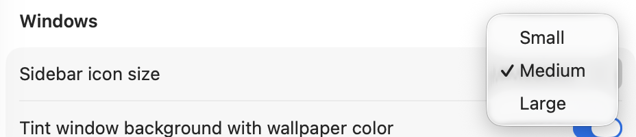
@JorgeF maybe you respect the system sidebar setting? It’s labeled “icons” but it changes the icon AND the text size in sidebars. I believe 11pt, 12pt, and 13pt are the sizes but not 100% sure.