Hey @dale — I’m not 100% sure based on your description, but I think what you’re looking for is this option, which you’ll find when you have the symbol source selected.
Thanks for all the feedback here @Jean-Francois-b — some of it we’re already discussing internally based on reports from others. To address a couple of things that might be helpful:
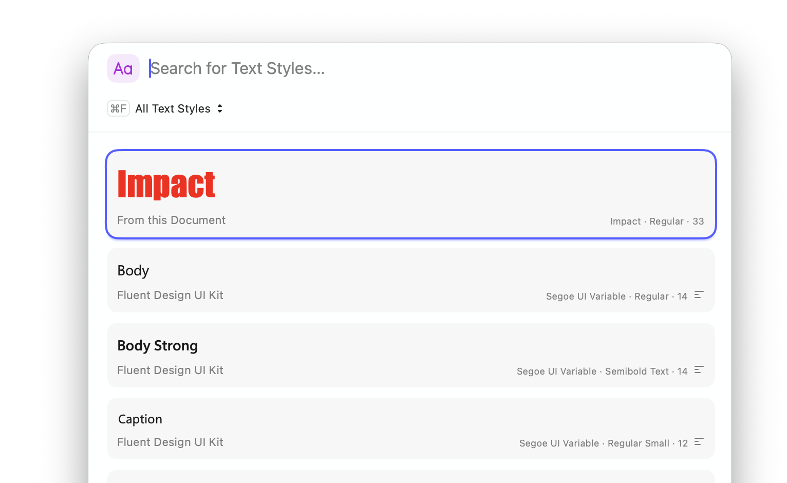
I’m not 100% sure what you mean by this, we do display previews for Text Styles in a few forms. In the popover menu, you can see here it’s using the font and color of my text style (and displays the size next to it):
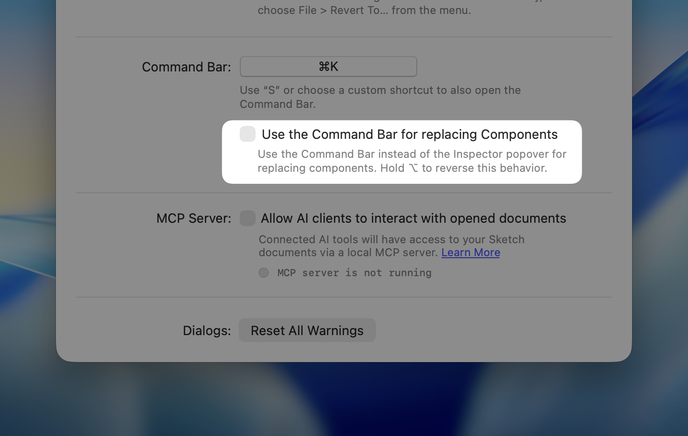
You have a few options here, if you’re replacing a text style, you can press ⌘ ⌥ R — this brings up the command bar in a special view for replacing components (this shortcut works with any component type — Symbols, Text Styles, etc.):
More details on all these Command Bar shortcuts and views on the blog.
By default, this border should not be inactive. The default layer style in Sketch is an active border here, which suggests you may have set a different default style at some point. That said, enabling that border if you change its color does feel like something we should do!
I hope those help! I’ll share your other comments with the team, of course.
freddiewrites
(Freddie Harrison)
Split this topic
47
@here Folks — one more reminder, if you sport something that even remotely feels like a big, please create a new post in Share an issue. This thread is already pretty busy and there’s a good chance legitimate bugs will get missed here. Even if you’re not sure if something is a bug, post it there and we can figure it out easier.
If your feedback is generally about the redesign (things you do/don’t like) then by all means continue posting them here. But anything that remotely feels like a bug, please take it to Share a issue. Thanks!
Sorry, I was indeed talking about the popover menu, where the style preview is only for the “Aa”, and not the name of the style like it used too before.
This panel is actually really nice and the name of the styles are actually the previews, unlike the popover. I think I would prefer having this in place of the popover, or some kind of combination.
I definitely need to start using the command bar and replace and learn the shortcuts.
Oh, that’s interesting, it’s very probable, I don’t think rectangle should have border by default . I think I assumed this was the default as it’s the beta and I didn’t think I had configured it, or that it might take my normal Sketch settings.
As you said, the little issue is still present and it’s different than how it worked in older versions.
Thanks for the follow up. I’m not super excited by the new look, but quite a lot by the new inspector structure and the possibilities that it opens for new features!
Honestly, the Command Bar is great for this stuff. I know I’m paid to say this, but I also believe it — even if I don’t have this setting enabled myself. In my defence, I use the keyboard shortcuts heavily
You’re very welcome to remove it completely and then do Layer > Style > Set as Default Style if you want!
I raised the issue of the border not enabling when you changed its color with the team — we’re looking into it. If it’s straightforward enough, it’s very likely we’ll have it working in a future beta.
Thanks again for the feedback — and for keeping an open mind about the new look!
Very nice, I might try that. Not sure I like having to double click every time, but I’ll give it a shot.
Probably what I had done already, but didn’t remember. I’ll just remove the border completely in my default and this will mostly stop this issue happening for me.
BTW, big fan of using ‘option’ in the inspector for additional functionnalities!
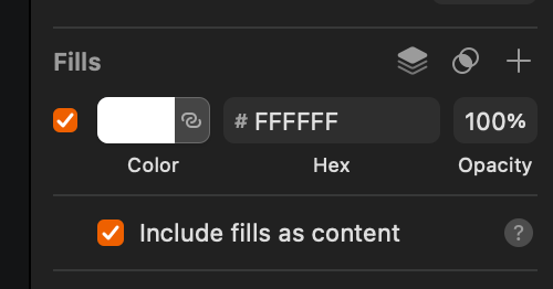
Really nice to delete fill/borders.
If I can add comments about the color popover.
In color variables, I’m not a big fan of having the whole line/block colored, I prefered the easier readability of just a circle or square of color and a plain name.
I see we can now add blending-mode per fill? Is that something new I missed before? It’s really nice, although I think there should be some indication in the inspector, before opening the popover, that a blending mode is active.
Mouse right-click menu
I somehow relied a lot on right-click an element and “Send Backward’ (and using ‘option’ for ‘Send to back’). Now with the extra sub-menu I feel like I’ll have to learn the shortcuts. Kudos for those shortcut working on French Canadian keyboards, something I can’t say of other big design softwares..
We have a bunch of folks working on all manner of keyboard layouts, so we put a lot of effort into making those shortcuts work as universally as possible! Glad to hear that’s working out for you.
The fields that handled numerical values in the inspector previously featured steppers, but they have since been removed. As they were quite beneficial, I kindly request that they be reinstated.
Hey folks — we’ve just pushed a beta update which fixes a bunch of small things y’all have reported. It’s honestly kind-of hard to keep up with what’s being fixed in each beta right now, but off the top of my head, I know that changing the color of an inactive border now activates it (cc @Jean-Francois-b).
Please keep the feedback coming! We’re getting a lot of great stuff from y’all already and it’s hard to keep up and reply to it all individually, but we are reading it all and discussing it internally. Expect near-daily updates while we continue to improve on things.
Manual sorting of variables would be great too. I know I could use numbers in the names to get a sorting that makes sense. But I can’t change them because they are part of a design system with semantic names. Plus it would mess with exported tokens too.
I don’t always want to copy, sometimes I just want to check through different elements on my canvas if there are any differences. I can see the settings for my borders right away, I would like to see the same for the effects.
In short, macOS 26.1 introduces the option to switch between clear and tinted glass. We’ll support for anyone who would prefer it to be a more opaque/solid color. Regarding the toolbar items changing, consider it noted.
I’ll double-check but I believe the icon for components and Libraries being the same is intentional. Libraries are effectively just documents of components as far as Sketch is concerned.
I like the idea of selecting all instances on the page, I’ll ask around about feasibility.
Hey folks Today’s beta update includes a number of small fixes and improvements, but also nested folders!
In short, projects and collections in your workspace are now simply folders. This revolutionary naming reflects the fact that unlike projects and collections, you can now nest folders infinitely. So, if you need to get very specific about how you organize your workspace, this is for you.
A couple of important notes:
During the beta, nested folders only appear in the Mac app. In the web app, you’ll still see projects and collections. Any nested folders will appear as single-level collections within a project.
You can nest folders infinitely, but they’ll always inherit the permissions of their top-level parent folder. This avoids a world of pain trying to infer which set of conflicting permissions wins out.