[WebApp] Sidebar for Pages and layers

Can we get a proper sidebar in the Sketch web app for the Pages view, with a layers panel similar to the one in the Mac app?

Right-clicking here and there just to see a tree structure of layers is frustrating and time-consuming. It disappears as soon as you click somewhere else, and then you need to click the exact spot again (where was that spot?) to make the list reappear.

The fact that you have to guess where to click to get a complete layers list for a component is a nightmare…

Just make it 1:1 as in the Sketch App.

Can confirm this is being worked on right now!

8 Likes

Oh my god, YES!!!

1 Like

@Treword As @freddiewrites says, we’re working away on bringing a proper layer list to the Inspect mode in the web app (I’m glad to see you’re excited to hear this too, @OndrejTom :smiley:).

Here’s a quick sneak-peek for those reading the forums (:eyes:) that I recorded this morning. Bear in mind that this is a work-in-progress, as we really are working on it as I’m typing… but we hope to ship it soon.

CleanShot 2025-12-08 at 10.19.33

5 Likes

@tim Great to see your team working on this.

I’d like to share a few suggestions that could make the workflow smoother and more efficient.

Clicking the [Inspect] icon in the corner is always the first step we take, and it’s simply a waste of time and effort. In the video, you can see how far the mouse has to travel to reach that icon and then go all the way back to the layers list. Please don’t move that icon to the left side — instead, make the left and right sidebars always visible :+1:t2:.

The floating sidebar and inspector look nice, and the shadows are well done. But this is a developer tool — no one cares if UI elements float or pop out.

What actually matters is:

  • Rendering performance (which is… slow).

  • Fast, efficient UI → fewer clicks = better.

  • Developer-oriented ergonomics → a compact layout that displays a lot of information in a small space.

You’re probably familiar with Xcode, Unreal Engine, Visual Studio Code, or the Web Inspector / Firebug. Sketch is the opposite of those tools, and that’s a problem. And please, don’t tell it’s a Sketch way of doing things… It’s wrong.

Consider reducing the font size and placing listed elements closer together. We need to see more items at once to scan the context quickly, without constantly scrolling, clicking, or unhiding what should be right here with zero clicks. Our eyes and brains can process far more information than the current interface allows without clicking and scrolling. Feed us like pros, not like TikTok users who can handle one thing at a time. It may sound harsh, but it’s true — this tool is used by people who scan super log files and find what they need in a second.

Please don’t make Sketch feel like a toy instead of a professional developer tool.

Also, limit UI movement as much as possible. Keep elements static and well organized. Don’t hide features just for the sake of a cleaner look. Place them where they are immediately discoverable and usable — with no extra clicks just to reveal an option.

The closer your WebApp is to the Mac app, the better. Don’t treat it as something separate. It should be as similar as possible. When a developer asks me, “Where is this thing in the WebApp?”, I get the same bad experience they do — because I don’t know either and have to figure it out. There is no need to learn a completely different UI scheme of the same tool.

For example:
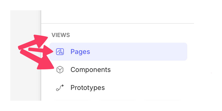
In the Sketch App, the option for switching views (Pages/Components) is always visible and located on the left side of the app.
In the WebApp, to open the Components view you have to click the [i] icon — which feels like “I have no idea where to put this, so let’s hide it under the information icon.” This creates several conflicts:

  • Seeing the [i] icon suggests it should be tied to the I key. It’s not — it’s D.

  • The second “i” suggests “Inspector.” But it actually means “Document Details” (not even “Document Information”).

There’s yet another place where you can find a link to Components: in the breadcrumbs. I’m not even sure whether it’s real breadcrumbs, a menu, or some hybrid, but what I do know is that it works poorly. I never know what will happen when I use it — sometimes it behaves like breadcrumbs, sometimes like a dropdown, sometimes it shows names, sometimes only icons. But what I know for sure is that you tend to hide absolutely essential tools and features.

That’s just one example illustrating the issue for your further analyze.

From my perspective, Sketch WebApp is built on the wrong conception about what we need and how we want use it.

Thanks for the feedback, you’ve clearly got a lot to say on this and I’m not going to respond to each point here individually, but to pick up on one thing because it’s quite important:

The web app as a whole is not intended solely for developers, never has been. Not only is that not our intention but we know from speaking to customers that it also isn’t the reality. Some use it to share designs with non-designer stakeholders in their org such as project managers. Others are freelancers sharing designs for sign-off by clients. Other times it is developers using these tools as part of the handoff process.

So, we consider more than one use case in the designs here. Equally, we have folks who exclusively use the web app and not the Mac app (and vice versa) so 1:1 parity in the UI has never been our goal either. Indeed, even if we did aim to make the Web app as close to the Mac app as possible, we wouldn’t end up with a developer-centric UI optimised for folks who are used to dealing with tools like Xcode and Visual Studio Code because we’ve designed the Mac app for designers.

The inspect tool specifically is a developer tool, yes. But it exists within the wider UI where we have to balance out a range of use cases. Which I think goes some way to explain some of the things we’ve done which you’re pointing out.

Thanks for taking the time to feedback. As with any work in progress, there is plenty that is liable to (and will) change.

I’m glad to hear that you’re happy to see us working on this.

To this point, the inspect tools in all of these applications are of dubious utility anyway. The majority of developers care more about the export experience over the inspection tools. UI software by its nature does quite a bad job of capturing enough information to make decent markup choices.

For tasks like exporting previews and sharing files, we can easily use Jira, Asana, Slack, ClickUp, email, etc. These platforms are simply better suited for discussions with managers, developers, and clients than Sketch.com — and that’s unlikely to ever change for many reasons.

What I mean is: there are things you can do perfectly well outside Sketch (such as communication, collecting feedback, or sharing files). And there are things you can’t do anywhere else and that need to be handled within the Sketch environment.

I’m not sure the time invested in building features that we can already maintain easily elsewhere — and that are not really a pain point for anyone — is being spent wisely.

The opportunity for the WebApp is huge, and it has been there for a while. Maybe reconsidering the fundamental problems you’re aiming to solve with the WebApp will bring a better payoff for everyone.

The idea of “design on Mac, develop on any platform” is genuinely interesting. And a great WebApp could truly make that possible.

I’ve been thinking about this for a few days, and I believe there is a limited number of things the WebApp needs in order to open the door for developers who would be willing to leave F_gma — provided that certain features are in place.
What I’m sure of is that developers are generally more willing than anyone else to switch tools. They do it all the time — their work environment is constantly evolving/changing, and they’re used to adapting.

If it’s better — or the same but cheaper — they switch.

@tim - I’m keeping my fingers crossed for you and your team :crossed_fingers:t2:. We’re really looking forward to the upcoming update with the layer structure always visible, even if it’s not perfect yet.

2 Likes

Appreciate the time and thought you’ve put into this. Thanks!