Increment stepper are gone. Please bring them back.
Thank you,
Everyone.
We have no plans to bring this back at this point but appreciate your feedback!
Very disappointing to hear.
Alternatively you can always use up/down arrow keys. They work the same way.
That’s what Franz von Holzhausen said when asked why they removed physical turn signal stalks from Tesla.
And yes, we certainly can! Thank you.
I have to click in the input field, take my hand away from the mouse and press the button on the keyboard instead of just clicking on the arrow. This is not the same)
I’m sorry you feel disappointed. We removed the steppers mainly because we would need to make the inspector even wider to support them. They don’t fit inside our text fields without compromising the value. A sample of our customers said they just used up/down key inside the field mainly to adjust values incrementally which aligns with our internal usage. It’s also not a UI element that we commonly see today, because of greater text field editing.
Nothing is truly final, so believe me when I say we’re listening to your feedback ![]()
Sorry Chris, but that is such a flawed rationale for removing increment steppers.
Allow me to share some various thoughts on the new inspector panel in this thread. After using the Beta for a couple of days, I think the new inspector is a major step backwards over the existing UX. Some thoughts bellow.
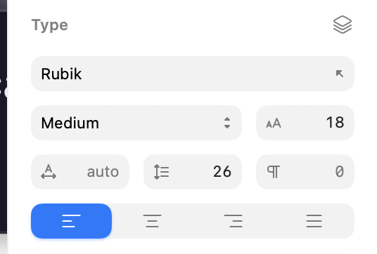
Document section - why is this persistent in the inspector? It takes so much off screen space. So unnecessary.
Where are all the alignment icons?
All the input fields are a little bit taller, gray color is lighter, with larger padding in between them. I get that you wanted to support the it’s the new rounder macOS visual design language, but this is inferior. How can I quantify and explain it? It’s a feeling.
Little toggles instead of checkbox - I like.
I prefer the lock icon (old UI) for locking the proportions ratio. I prefer the placement of the icon as well. It’s a better metaphor to have a thing that locks two things - in between the things.
Style panel - you hid the frequently used buttons for “create style”, “update”, “detach”, under the ellipsis menu. It’s an unnecessary regression.
Corners - old UI is better, but not by much.
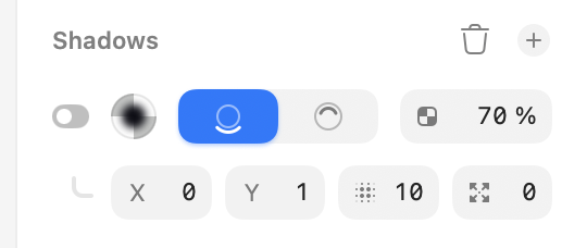
Shadow - old UI is better. It was much easier to denote shadows opacity.
Color variables - now a two click action. I miss having color picker on the same panel as a list of variables. Unnecessary to change this.
Labels - you removed the labels underneath the fields. It’s an unnecessary regression. Bad UX, bad usability. Instead, for example, in fields you added small leading icons with no meaning whatsoever. Then, when asked about removal of unit increment steppers, you say that by bringing it back you’d need to make the fields even wider. Makes no sense. Increment steppers appear as an overlay on mouse hover.
Unit increment steppers - in old UI, on mouse hover they appear as an overlay to the right of the field. Why would you need to make the field wider?
Removing dividers in between sections - bad idea.
Export - controls are hidden in the new UI - bad idea.
If you look closely enough and remove the idea that the, spacious, and rounder, and cleaner UI = better UX (and quite frankly better UI), you will understand the the previous interface is much better at all the functions it’s supposed to support.
Thanks you for writing this. Beautifully put! All of this makes me sad, because it can only signal how clueless and sans vision people at Sketch really are.
On the inspector width, the new one is actually wider with less functionality and worse UX. Incredible.
Folks, I’m sorry but I need remind you of the forum guidelines — in particular these two:
Please consider that some of the language used in these posts runs counter to that.
We’re very open to hearing opinions and counterpoints to the decisions we’ve made in the redesign (and believe me when I say we’re actively discussing them and reconsidering some of our assumptions along the way) but keep it respectful, please.
There IS space even know. Unless someone enters a four-digit number as a font size, the space is there.
Now maybe there isn’t enough space in some areas such as here:
And that’s fine. Make the Inspect panel a little larger. Or if you want to conserve space so much, let us enable the stepper in the Sketch settings.
@Treword I can say as a fact the most common screen size we see use on is roughly the 15 inch display. So I’m sorry, we need to consider all of our users, not only those with external displays.
@ekifol This feedback is probably better suited to a different thread but thanks anyway. Some things you mention are bugs, and some have been reported already we’re aiming to improve, and some things are just subjective. The document section obviously shouldn’t appear so if you have any helpful steps to reproduce that, our QA team would appreciate it.
Unit increment steppers - in old UI, on mouse hover they appear as an overlay to the right of the field. Why would you need to make the field wider?
As you can imagine, the hovered stepper would hide the part of the text value that you’re actually adjusting for one. “Simply” aligning the text on the left would have the sam issue with large values. I mean I personally think an always-visible stepper would be better than one that appears only on hover to be honest.
I don’t feel like I need to say anything else here given where the discussion is going. Of all the changes made, I didn’t have steppers to be the thing that would result in personal insults.
Oh, and for the Effect → Color Adjust, I can’t use the missing stepper, and I can’t even use arrows, those don’t work there.
Something that may help here is that you can actually drag on the icon/label within the fields as a replacement for the steppers.

If you just drag, they will change the value in increments of 1, if you hold ⇧ while dragging, it’s increments of 10 and if you hold ⌥ then it’s increments of 0.1.
These are a pretty direct replacement for the stepper controls (as with those, you could also use the ⇧ and ⌥ modifiers).
I hope that this helps!
Dear Chris, pardon me, but which part of what I said could be considered as a personal insult? I’m questioning your professional design decisions, your design philosophy, and your product vision. That’s not a personal insult. Let’s get real.
The fact that some people here are so passionate that they’d write lengthy posts full of useful feedback and rationale about unit increment steppers, shows you how passionate these people are about design, their tools, and your product! There is more, we just don’t have the time nor will to engage.
We’re just tired from talking into the abyss and seeing our tools and software slowly deteriorate. That’s all.
Finally, I will say - I am sorry if anyone felt any of the words written as a personal attack. That was far from my intention.
P.S. There is good stuff you did with this redesign, don’t get me wrong. The icons are lovely, the layers panel is a huge improvement, your liquid glass implementation is nice, the blue accent color I don’t mind, and actually has a perfect hue value! The rounder nature of the window, which follows the Tahoe framework - I actually like, it feels fresh, albeit a bit bubbly; but I like!
Love, peace, and pixels. Very best!
P.P.S. unkind truth > kind lie
I agree with the points of the feedback, but I also agree with the fact that it can be communicated respectfully.
Replacing: “it can only signal how clueless and sans vision people at Sketch really are“ with “it feels to me the Sketch team might be losing their vision regarding who this product is for“ goes a long way.
We are design professionals, the profession requires great communication skills, so let’s also communicate in a professional manner.
Folks this thread will be closed now. We have some clear opinions here and will gladly continue discussing the specific issue internally. But this thread itself is heading in a direction that doesn’t feel very productive for any of us. Thanks