New Mac beta: v102 available now!

Hey @Ash thanks for sharing these interesting thought. It’s a good observation, and we’ve tested and debated both options but decided against them for now. Regarding the first point, there was some confusion during testing. And for your second point, the tab key, we already have different plans for that.

That said, we will monitor the feedback and keep looking for more ways to make navigating easier.

That’s quite disappointing to hear, would you guys be open to making an option to toggle this auto highlight behaviour? I personally find it to be one of those features users don’t know they want until they’ve used it for a while. That’s kind of the whole appeal of command palettes, speed.

TBH without it, it kinda doesn’t make it much faster than previously for me personally. Like if with the regular command bar, if I had to search for a menu option then click it or navigate to it with the mouse, it wouldn’t be much different to using the menu search in Mac OS, just a different interface. Make sense? This is largely that in this form, a prettier but not hugely more efficient way of doing something we could already do.

We’ll wait and see for now. The beta period is a good time to test the feature and gather insights. We can always tweak things at a later stage.

Yes, I was doing the right scrolling behavior. Left solution is a good substitute but the idea behind my suggestion was to add a bit more smarts to the artboards.

1 Like

@Ash Good news. We’re going to enable enable auto-selection of the first item in the next (or future) beta update. Keep an eye on it :slight_smile:

1 Like

Awesome! Thank you :smiley:

Another observation when replacing symbols. If I set a background colour (Say my symbol is white) I feel like the picker should respect that preview value, or have a toggle to hide/show them. Or even just like a checkerboard or something

Wow, it is nice to see that you are working on a lot of cool improvements.
I’m not sure about the others, but the only thing I don’t like is the command bar, which is now integrated with symbols, layer and text styles. At first glance it looks like an unfinished concept full of UI problems. I hope you will take the time to validate and improve this concept before forcing it on us.

Command bar observations

Symbols

  • It’s distracting. The command bar now covers the symbol I’m trying to replace.
  • The command bar window contains fewer Symbols than in the previous solution.

Layers

  • The two-column layout makes it slower to scan the list.

Text

  • The command bar window contains fewer Text styles than in the previous solution.
  • The window has a lot of wasted space. It’s less compact.

General

  • The command bar has no scroller. How do you expect people to navigate with the Wacom pen?
  • The search is limited to the selected folder instead of all icons. Now I have to go to the root directory to search, which means more clicking around.
  • The command bar has no title bar and this makes it difficult to understand how to move it.
  • Now you have to press the Replace action to confirm the change.
  • The command bar closes automatically and if you want to try another icon, you have to move your cursor to inspector and then take additional steps on the window. This means extra steps and it takes longer.
  • To see more content you now have to scroll instead of just moving a cursor down.

It would also be interesting to know why you are switching from the Menu to the Command Bar window, and what can you do faster, easier or more on each screen in the Command Bar that we could not do with the old menu solution?

3 Likes

I had assumed the command bar would have been in addition to the menu. I was a bit dismayed when I tried to change a symbol instance from the sidebar earlier and it opened the command view instead. The lower information density makes sense in the context of “I know what I want, just give it to me quickly please” from a text input. Going back to the early days of this pattern it was all about reducing menu usage. It doesn’t replace the existing menus.

The higher information density of the menu on the sidebar makes far more sense in context. This should not replace the existing UI

2 Likes

I think Command Bar might work but it does feel, as I already mentioned, less natural way to do some things like changing text and layer styles. I think there are ways to improve on these issues:

  • There should be more options to customize command bar window – size, width, list/grid view, sort options etc.
  • Information density should be higher. For most people using Sketch a lot, the preview of the text stye is not super important so it can be smaller.
  • I would also like to see command bar being placed intelligently next to the component you are trying to replace when replace action is invoked. Otherwise I have to move command bar a lot during work to see the canvas. Yes, I can move it to the side and keep it there but for this type of interaction it is weird to have it placed way off the center of the screen. I guess Alfred, Spotlight and similar tools made us expect it to be a centered experience on the screen.

Regarding having both menus and command bar to do the same thing I think that would be a big overhead for the Sketch team. They need to pick one solution and make it really good. I think that will most likely be the command bar.

1 Like

Hey folks :wave: Appreciate you all taking the time to try out the Command Bar updates and give us feedback on it. There’s a lot of comments here, and I won’t address them one by one (some have already been addressed elsewhere on the forum), but I wanted to point out a few things that may be helpful to you:

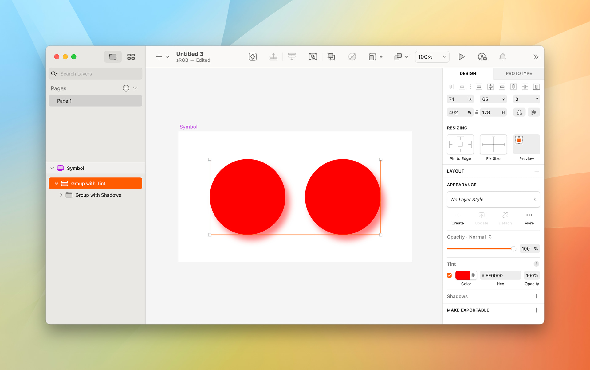
First off, if you’d like, you can bring back the Symbol swapping menus in the Inspector by unchecking this option in Sketch’s settings:

Second, there are a number of keyboard shortcuts we haven’t communicated clearly yet (we have plans to do a better job of this in final/later builds) — this is my fault, so it’s only fair I run you through them here:

By default, if you’re replacing a Symbol with ⌃⌘R we’ll land you in the group that Symbol is from. If you want to search everything and not that specific group, hit ⌥⌘↑ to get back to the top level (all your Libraries) and then start typing to search. If you just want to go up one level in your groups, you can press ⌘↑

Sketch Beta 2024-10-28 at 09.42.27

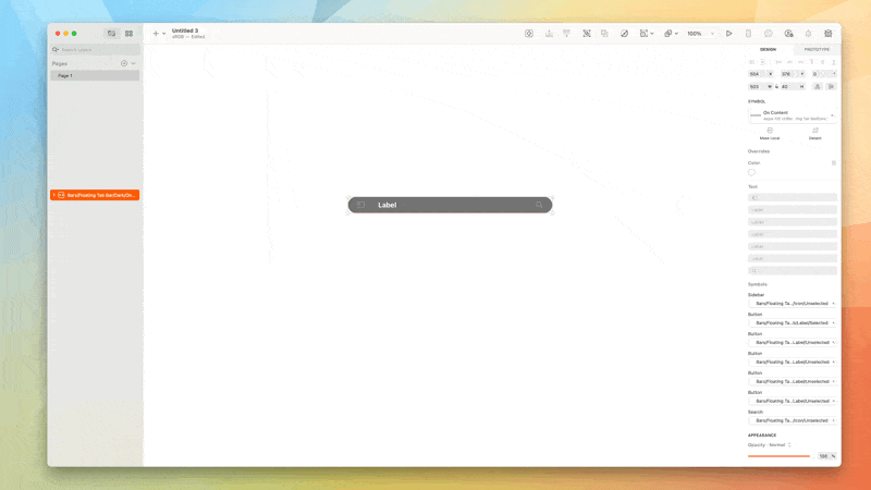
And you can see from the video above, when you’ve chosen a symbol, you can press enter to insert/replace it, you don’t have to click the button.

Likewise, if you want to try a different Symbol, you don’t have to click in the Inspector, you can just press ⌃⌘R again to bring up the Command Bar in swapping mode. This works for any component type.

On the subject of navigating through groups, from any level, you can press ⌘↓ to start navigating through the tree view — again the arrow keys are your friend here.

Sketch Beta 2024-10-28 at 09.56.44

We’ve done a lot of work to make search as fast as possible — it’s fuzzy, so even if you have the faintest idea what you need, you’ll find it quick by hitting the replace shortcut and typing something.

Sketch Beta 2024-10-28 at 09.53.38

Regarding the comments over the design of these views and the information density. The team are listening! They’re already considering some ways to present more compact views in the cases of small icon Symbols, for example. Likewise with positioning/repositioning the Command Bar as a whole.

And that’s my overall message here — that we’re paying attention to the feedback, considering it and making changes where we need to. This thread, if you scroll through previous messages, is evidence of that.

We’re fully aware that changing something as big as how you find/insert/replace components, especially in dense Libraries, is a big change. A lot of what you see in this beta is acting on feedback that’s existed about the swapping menus, and the old Insert window, such as including larger previews of text styles.

We also live with changes like these internally long before they hit betas and work with some fairly large Libraries. Picking up all the various shortcuts is a learning curve, no doubt about it, but we have found it to be faster in day-to-day to work. If we hadn’t, we wouldn’t be at this point. :wink:

Please, keep the feedback coming, I can’t stress enough — we do listen, and we do consider all of it.

8 Likes

We use this mechanism a lot across our design libraries. What is the correct way to achieve colored shadows that can be overriden in instances?

Hey folks, there’s a new update available for the Command Bar: it’s now possible to resize the window.

2 Likes

Good question! Because Tints will always affect the contents of a group (we consider applying a border to a group to be styling, rather than content), the easiest way to achieve this now, is to create a ‘containing’ group and give that your Tint, like this:

This would then allow you to override the Tint on a Symbol instance:

2 Likes

@jonne The option to bring back the icon swapping menus in the settings is nice, but it does not help because you have removed the search option from the menu and you are still forcing us to use the new command bar window.

Most of the time I use the search option in the menu to find icons, so this is a no-go for me, it’s distracting and slows down my workflow. Please provide full support to restore the symbol swap menu with search.

Hey @Paulius, I’m afraid this is not part of our plans.

In that case “Use the Command Bar for replacing Components” option is misleading, as we will be forced to use the new Command bar to search.

However, I think if you spend more time refining the Command Bar, making it more compact and better, it could work.

Some suggestions for improvement

  • List layout option
  • Option to pin Symbol search (Command bar) to float on top and stay open
  • Shortcut Go up one level ⌘↑ it might be easier if it was ⌘←go back one level
  • I’m not sure about others, but I find it a bit difficult to hit ⌃ ⌘ R it might be easier if it was ⇧⌘ R
  • Please consider enlarging the drag area and perhaps adding a title bar

Thanks

2 Likes
  • ⇧⌘ R is already assigned to rotating objects. It took me a few tries to get used to ⌃⌘ R, but it’s easy to get the hang of it, in my opinion.
  • Based on some of the earlier feedback, we’ve enlarged the dragging area. This change is in the latest beta.

We’ll take the rest into consideration.

Do you have a lot of users who use the ⇧⌘ R Rotate shortcut?
I would not mind if this was replaced, as swapping symbols is much more important and will be used a lot by many.

We believe so, yes :slight_smile:

1 Like