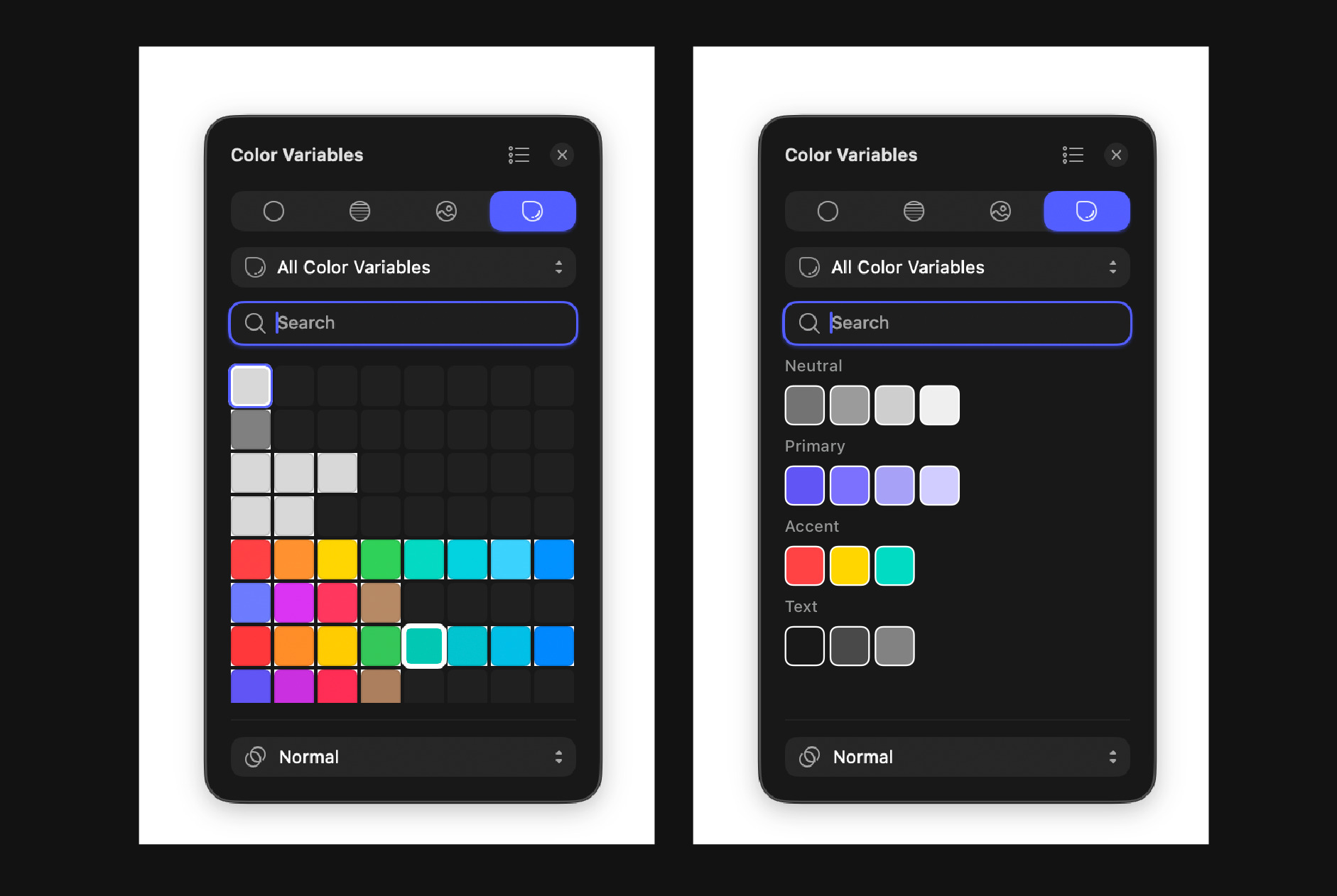
The color variable panel currently looks ugly, as you can see on the left. Why not make it look better and group it? Something silmilar to this on right.
Hey, I appreciate the feedback, thank you.
I can see a bug with the rounded corners that makes this seem a bit ‘ugly’.
This view was designed with large number of color variables in mind, and we heard feedback it was important to be able to view as many of these as possible without the need to constantly scroll. You can filter down to view specific groups using the dropdown button above the search field.
1 Like
+1 to the headers.
1 Like
Consider the request noted ![]() Looking into it as we speak
Looking into it as we speak
4 Likes


I absolutely love this! ![]()
I appreciate that you’re listening to real designers and developing a tool for them, not just for stakeholders.
3 Likes
