I am having a really hard time with the new Symbols panel (Y) and its absorption into the command menu. I feel like all the organization that went into building symbol libraries is almost useless and my workflow feels stunted.
Right now I select a folder and am shown way too many unrelated symbols all mashed together. No matter how organized the structure is it is very hard to make sense of, especially in readily available libraries like the Apple supplied iOS and macOS ones.
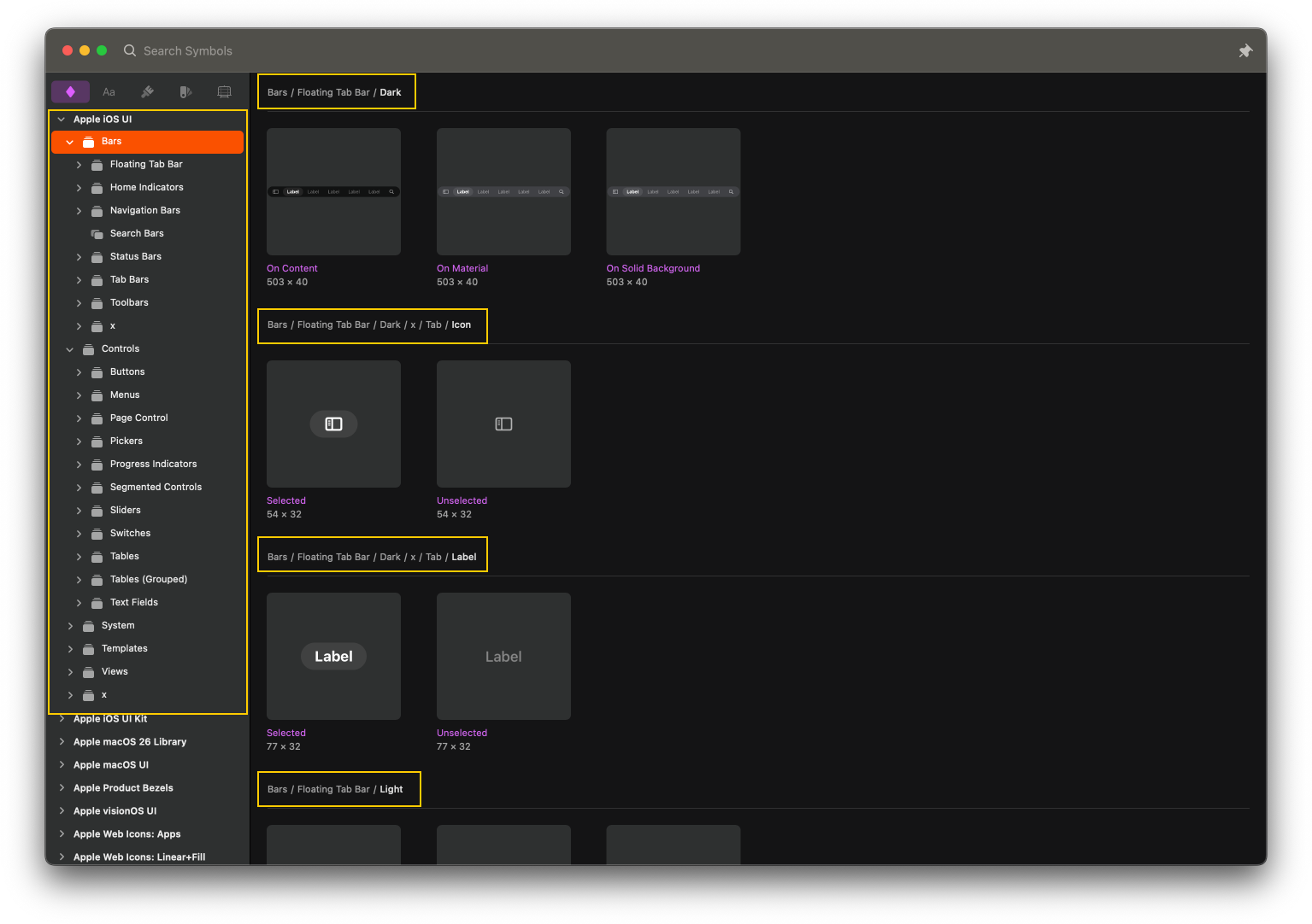
In the previous version the Symbols window (accessed by just hitting C) made it easy to see hierarchy within the sidebar with collapsible groups and then sectioning things out within each group. All the nesting and organization is apparent and symbols that belong together are not mixed in with ones nested below that may be irrelevant. See attachment below.
I am seeing a lot of this functionality still in the Components Mode inspector but this is not useful for those that use Libraries, only for local symbols.
Thanks for taking the time to share your feedback. You can still access the library menus in a very similar way through Command Bar.
This may be just a first impression of seeing the starting point, which is an All Symbols view. All the groups are still there. After pressing Y, press ⌘F, then select the library you need and you’ll see the same groups. You can also use your mouse to navigate through the path bar.
It’s very useful to note that once you’ve inserted symbols or typed a search term, the Command Bar will remember this and give you the same group you chose last time and the same search term.
The new shortcut is also one letter long Y, plus you can still use the previous one, C
Once Command bar is open, you can navigate libraries on the path bar using your cursor or with shortcuts
Only the All Symbols view displays everything. Any other view will display only what you select, from a whole library to a single group
The library structure is still there in the path bar. Open it with ⌘F, or click on it to display the available libraries
One final bit: we made a walkthrough video that I think is quite useful. In it you’ll see how the Command Bar brings together two proceses in a way that wasn’t possible before: inserting and replacing (with search included of course)
Thank you for the follow up and example videos. The main thing I am still missing is the organization within a group that shows me the groups within it.
For example if I have group like this Button > Primary and within that there are three groups Compact, Large, and Standard. I would expect to see those three groups separated when selecting the parent group of Primary. This is the feature in the previous version I am referencing.
There are instances where within a group there is a folder often called x that houses all the smaller symbols used in a parent symbol that would likely never be used individually. Right now those symbols will show mixed in with everything as opposed to being organized together in their own sections.
I hope this makes sense and I think a little more hierarchy distinction within the grid of symbols would help a lot, instead of solely relying on the breadcrumb. The loss of the side bar with accordion menus as well as the sectioning of groups within a group are making large symbol libraries more difficult to navigate.
Thanks for the reply. Indeed, that’s one of the changes between the previous Insert Window and the Command bar. I can see your point clearly, thanks for sharing the details
There’s also a new option to control what’s displayed in the Command Bar. You can now set specific symbols to be available only to insert or only as overrides. Symbols set as available to insert only are excluded from the Command bar, Insert and swapping menus. You can exclude the x folder with this option.
Switch to the Components View
Set the symbols you need available as overrides only